
educabr2 ships a small, opinionated plotting toolkit so
that a query becomes a publication-ready figure in a few lines. The
design follows the principles of Kieran Healy’s Data Visualization:
A Practical Introduction: build on a clean minimal theme, use a
colorblind-safe palette, label honestly, and let the data — not the
chrome — carry the story.
The three components
-
theme_educabr()— a serif theme built onggplot2::theme_minimal(), with quiet grid lines, a bottom legend and tuned text sizes. If a local TinyTeX installation is found (and theshowtext/sysfontspackages are installed), the LaTeX font Latin Modern Roman is registered automatically, so your plots match LaTeX documents typographically; otherwise the theme falls back silently to the system serif font. -
scale_colour_educabr()/scale_fill_educabr()— discrete scales mapping to the Okabe-Ito palette, safe for the three common forms of color-vision deficiency. -
scale_x_year_educabr(years)— a year axis designed for the century-long series that are the norm in this package. Defaultggplot2breaks assume short spans and become unreadable over a century; this scale picks the break spacing from the span of the data you actually plot (every 20 years beyond six decades, every 10 years for spans of 25–60 years,pretty()breaks below that), always labels the first and last year present in the series, and drops any grid break that would collide with those extreme labels.
A first figure
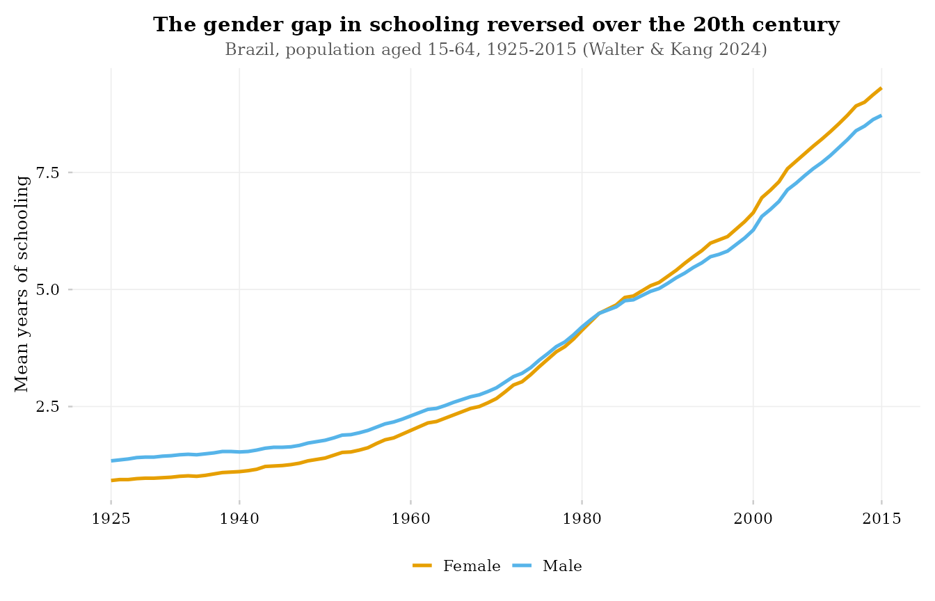
df <- get_schooling(geo_level = "BR", dimension = "sex")

ggplot(df, aes(year, value, colour = dim_sex)) +
  geom_line(linewidth = 0.9) +
  scale_colour_educabr(name = NULL, labels = tools::toTitleCase) +
  scale_x_year_educabr(df$year) +
  theme_educabr() +
  labs(
    x = NULL, y = "Mean years of schooling",
    title    = "The gender gap in schooling reversed over the 20th century",
    subtitle = "Brazil, population aged 15-64, 1925-2015 (Walter & Kang 2024)"
  )
Titles inside or outside the figure: plot_titles
For slides, blog posts and dashboards you usually want the title
inside the image (the default above). For LaTeX/Quarto
manuscripts the caption and source note live in the document,
and a title baked into the image would duplicate them.
theme_educabr(plot_titles = FALSE) strips in-canvas titles,
subtitles and captions:
ggplot(df, aes(year, value, colour = dim_sex)) +
  geom_line(linewidth = 0.9) +
  scale_colour_educabr(name = NULL, labels = tools::toTitleCase) +
  scale_x_year_educabr(df$year) +
  theme_educabr(plot_titles = FALSE) +
  labs(x = NULL, y = "Mean years of schooling")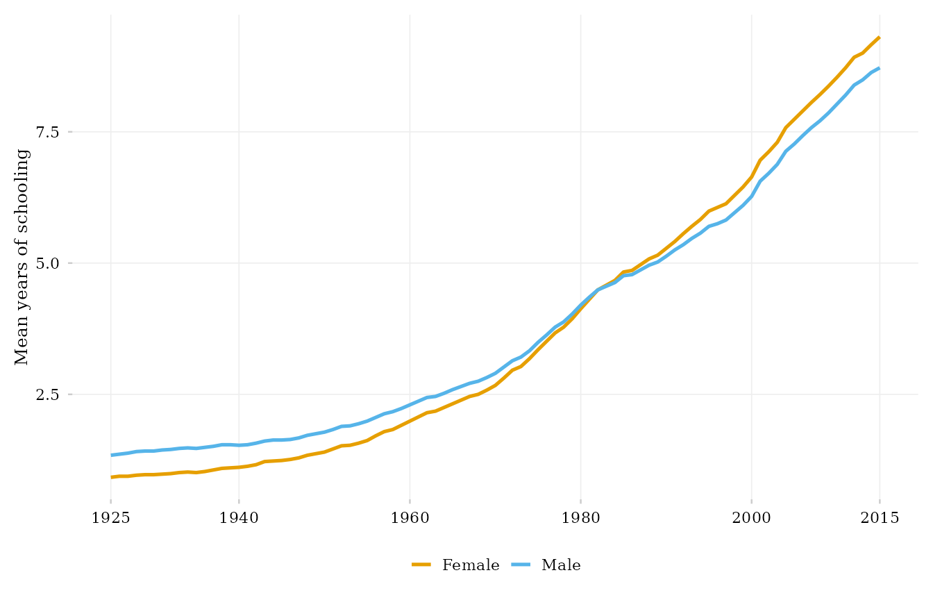
This is exactly how the figures of the educabr2
paper/appendix are produced: clean canvases, with captions and notes
written in the manuscript.
A century-long, multi-series example
ratio <- get_expenditure(indicator = "double_ratio_es_ef1")

ggplot(ratio, aes(year, value)) +
  geom_line(colour = "#0072B2", linewidth = 0.9) +
  scale_x_year_educabr(ratio$year) +
  theme_educabr() +
  labs(
    x = NULL, y = "ES / EF1 per-student spending (ratio)",
    title    = "Brazil spent 66x more per university student than per pupil in 1933",
    subtitle = "By 2010 the double ratio had fallen below 9 (Kang & Menetrier 2024)"
  )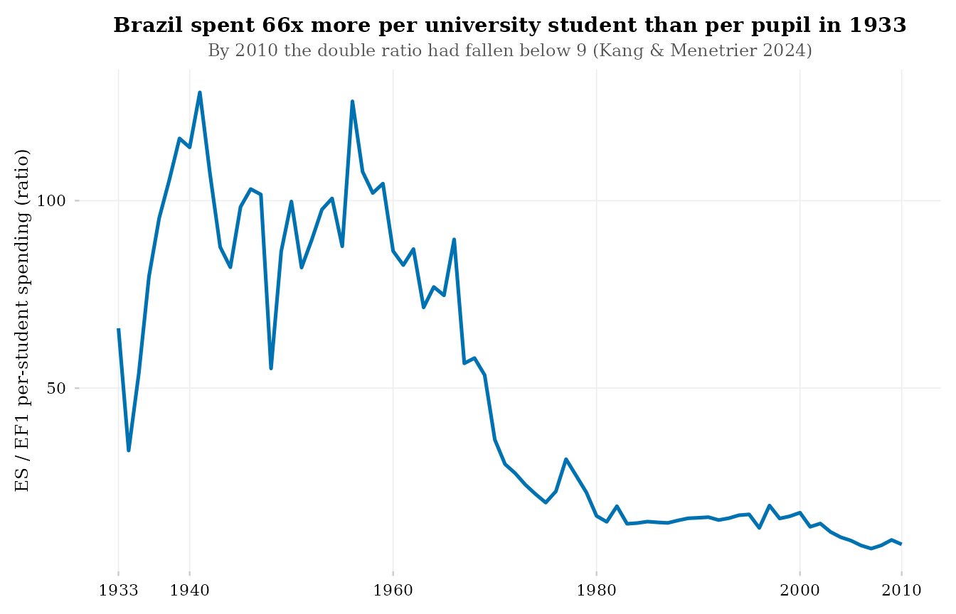
Note the axis: on a 1933–2010 span,
scale_x_year_educabr() places decadal-style breaks and
labels both endpoints — no crowding, no unlabeled extremes.
Palette reference
The Okabe-Ito palette used by scale_colour_educabr() /
scale_fill_educabr(), in order:
| # | Hex | Name |
|---|---|---|
| 1 | #E69F00 |
orange |
| 2 | #56B4E9 |
sky blue |
| 3 | #009E73 |
bluish green |
| 4 | #0072B2 |
blue |
| 5 | #D55E00 |
vermillion |
| 6 | #CC79A7 |
reddish purple |
| 7 | #F0E442 |
yellow |
| 8 | #000000 |
black |
Beyond 8 categories the scales will error — by design. A line chart with more than eight simultaneously coloured series is rarely readable; prefer faceting, or highlight a few series against a grey background.